Surprisingly, Microsoft has slowly developed one of the best Android launchers. The popular launcher was called “Arrow” until it was rebranded to “Microsoft Launcher” back in 2017. Since then, it has seen several major revisions. The latest update brings more big changes in key areas and readies the launcher for the dual-screen Surface Duo.
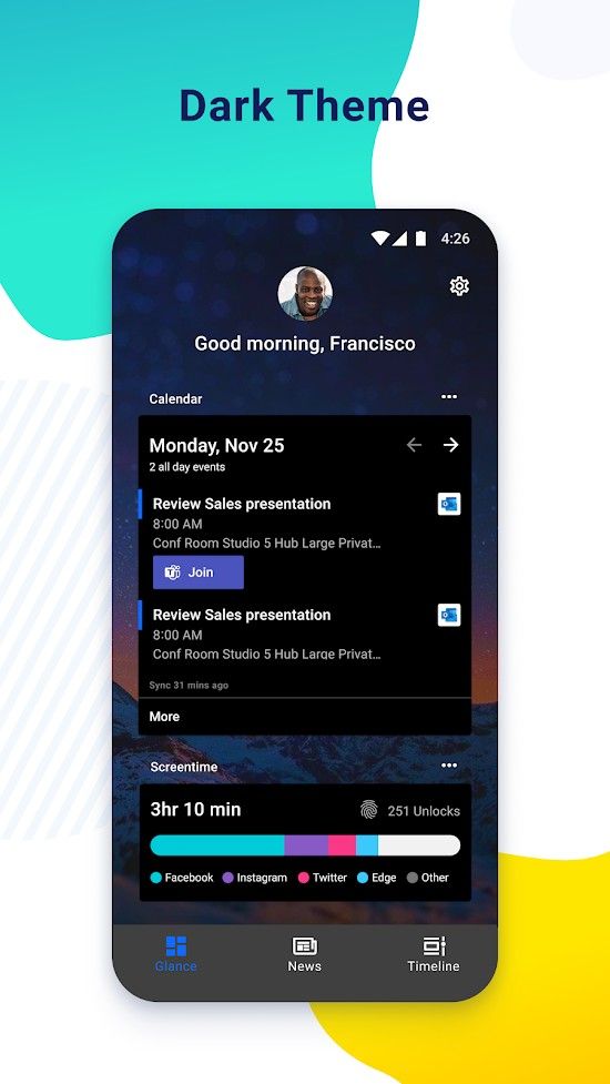
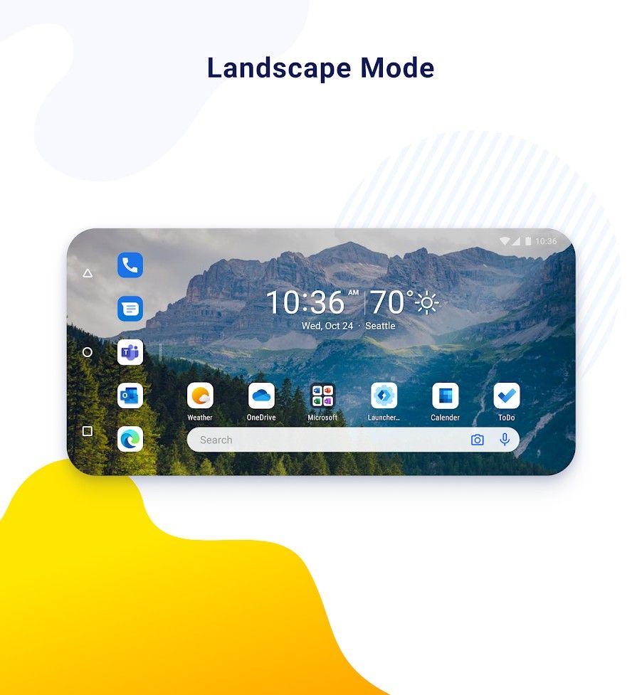
Microsoft Launcher version 6.0 is available now as a public preview. This update features a new UI that appears to be what we saw on the aforementioned Surface Duo. The home screen can now be used in landscape mode and it includes new icons, widgets, and some key areas have been completely rewritten. The activities area, app list, dock, and search UI, in particular, have been revamped.


The light and dark modes have been tweaked in this version and Microsoft is also saying it should have better memory performance. Microsoft Launcher 6.0 is now a beta release as it has its own Play Store listing as a “Preview.” So if you’re currently a beta tester, you’ll need to install this app separately. There are some bugs to be expected and some areas are a bit rough around the edges. If you’d like a sneak peek at what the Surface Duo launcher will feel like, give this a try.
Microsoft Launcher Preview (Free, Google Play) →
Source: Windows Central
The post Microsoft Launcher 6.0 previews a brand new UI, prepares for Surface Duo appeared first on xda-developers.
from xda-developers https://ift.tt/30iZ1Qj
via IFTTT


Aucun commentaire:
Enregistrer un commentaire